Google Ads landing page optimization improves the experience after a paid click by making the offer relevant, understandable, credible and easy to act on. Start with the search decision and the ad promise, then design the page and form around a useful next step. Measure completed, suitable actions rather than assuming that a cleaner layout or a higher button-click count proves better commercial performance.
A paid landing page has a specific job. It should help the visitor decide whether the offer fits and what to do next. That does not mean hiding all navigation, removing every qualification or reducing the page to a headline and form. The right amount of information depends on the decision and the risk the buyer faces.
What should Google Ads landing page optimization begin with?
Write a short page brief before changing the design. Identify the audience, search intent, offer, evidence required and intended action. Include the important limitations: geography, compatibility, business type or availability.
Review the campaign groups reaching the page. If visitors arrive with materially different needs, one destination may not serve them all. A broad service query, a specialist implementation query and an existing-customer support query should not automatically share the same acquisition page.
Inspect the current journey from the actual ad URL. Tracking parameters, redirects and external booking tools can affect the experience. A designer’s preview of the page may miss the route a visitor really takes.
Agree on the primary commercial measure. It may be a suitable enquiry, an activated trial or an order. Keep diagnostic interactions available, but do not confuse them with the outcome the page is meant to support.
An integrated digital marketing plan provides this context so page work does not become a series of isolated aesthetic changes.
How does ad message match work in practice?
Ad message match means that the page delivers the expectation created by the ad. The wording need not be identical, but the subject, offer and important conditions should be consistent.
If the ad promotes an implementation consultation, the page should explain the consultation, who it suits and what happens after the request. If it promotes a particular product capability, visitors should be able to understand that capability quickly. Sending them to a generic homepage can force them to repeat the search inside the website.
Google’s ad and landing-page guidance recommends relevant, useful information and a navigable experience. Those principles support a practical review: can a visitor immediately recognise that this is the destination they expected?
Match the qualification too. An ad aimed at a specific business type should not lead to a page implying universal suitability. Clear boundaries can reduce unsuitable actions and help the right visitor proceed with confidence.
What should the first screen communicate?
Give the visitor enough information to orient themselves: the offer, the intended audience and the next action. A headline should say something concrete. “Book a payroll implementation review” tells the visitor more than “Unlock your potential.”
Use a short explanation to clarify the benefit and process. If the action is a consultation, say what it covers. If the offer is a product trial, explain what the person can evaluate and any setup requirement.
Show a relevant visual when it helps understanding. A real product screenshot can explain an interface; a labelled diagram can explain a workflow. Decorative imagery should not crowd out essential information or create a misleading impression of the service.
The first screen does not need to contain every answer. It needs to make the page worth exploring and the offer understandable. On a phone, check that banners, menus and overlays do not consume the space where the core explanation should appear.
Which proof supports paid search page trust?
Choose proof that addresses the buyer’s concern. For software, useful evidence might include supported integrations, an accurate demonstration and implementation information. For a service, it might include a transparent scope, a genuine project example and the process the customer can expect.
Present results with context where you have permission and reliable evidence. State the starting condition, the change and the measurement period. Do not turn a result from one project into an implied guarantee for every visitor.
Testimonials should be authentic and relevant. Logos should represent genuine relationships and be used appropriately. If the page uses a hypothetical example to explain a method, label it clearly rather than presenting it as a client case study.
Proof placement should follow the decision. A statement about compatibility belongs near the compatibility explanation. A testimonial about implementation may help near the process section. Collecting every trust element into a crowded strip does not ensure that it answers the visitor’s actual question.
How much information should a PPC landing page contain?
Enough to support the action being requested. A low-risk purchase may need clear product and fulfilment information. A complex B2B demo request may need a more detailed explanation of fit, capability and implementation.
Organise the page by questions: What is offered? Who is it for? How does it work? What must the buyer provide? What evidence supports it? What happens after the action? Use headings and visual hierarchy to help visitors find the answer they need.
Do not assume that longer pages always perform better or that every visitor reads from top to bottom. Some scan for requirements; others look for proof or commercial terms. Important information should remain easy to locate.
Link to deeper documentation when it helps evaluation. A landing page can remain focused while giving a technical buyer access to relevant detail. Removing every route to supporting information can make a complex offer harder to trust.
How should PPC landing page forms be designed?
Request information that serves a defined purpose. A field may support routing, qualification or preparation for the response. If nobody uses it, reconsider asking for it.
Use persistent labels, clear instructions and helpful error messages. W3C’s accessible forms tutorial covers labelling, instructions, validation and notifications. These are practical usability foundations, especially when a visitor uses a keyboard, assistive technology or a small screen.
Explain the action in the button and nearby text. “Request an implementation review” is clearer than “Submit” when that is the actual offer. State how the request will be handled without making response promises the team cannot deliver.
Test unsuccessful states as well as successful submissions. What happens when a required field is empty, an email is mistyped or the service is temporarily unavailable? A form should help the user recover rather than discard their work without explanation.
There is no universal best number of fields. The right balance depends on the offer and the information needed for a useful response.
What should happen after the form is completed?
Confirm receipt and explain the next step. If a resource was promised, make it available. If a meeting is the next action, provide a usable scheduling route. If the team needs to review the request, say what that review involves.
Send the record to the appropriate owner with the context already collected. Preserve the page or campaign information where the measurement setup allows it. The visitor should not need to repeat their entire request because the systems discarded it.
Define handling for existing customers, duplicates and unsupported enquiries. A current customer seeking help should not automatically enter a new-sales sequence.
CRM integration and marketing automation can support this flow. The automation should change or stop when a person replies, books a meeting or enters an active sales conversation.
How should mobile usability and performance be checked?
Test the task on real screen sizes and realistic conditions. Check whether the main content appears promptly, controls respond and the layout remains stable as assets load. Inspect form keyboards, tap targets, validation and any external scheduling step.
Use performance tools to investigate bottlenecks, then verify the actual experience. A single lab score is a diagnostic observation under particular conditions, not a complete description of every visitor’s experience.
Prioritise elements that obstruct the commercial task: oversized images, delayed form scripts, overlays blocking the action or controls that move unexpectedly. Preserve essential accessibility and security while improving performance.
Web development should verify the implementation, and conversion rate optimization should keep the visitor’s task at the centre of prioritisation. Improving a decorative animation is less urgent than repairing a form that cannot be completed.
What does landing page conversion tracking need to verify?
Map the intended event and test that it occurs at the correct point. A completed submission should not be replaced by a button click that can happen before validation. Check duplicates, return visits and the counting settings relevant to the business.
Compare a sample of page actions with records received by the business. Google’s conversion troubleshooting guidance provides a starting point for recording issues. A tag installed on the page does not prove every action is recorded correctly.
Keep qualification and later outcomes connected where appropriate. A page can increase submissions while reducing their usefulness. Report valid enquiries, qualified leads and commercial progress alongside raw conversions.
Document tracking repairs and definition changes. They can alter the recorded rate without a change in visitor behaviour, so they belong in the performance review.
How do you choose a useful landing-page experiment?
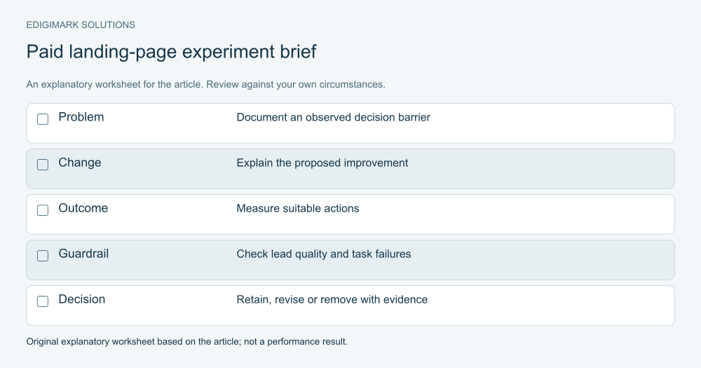
Start with evidence of a problem. Visitor interviews may reveal an unclear offer. Sales feedback may reveal missing qualification. A task inspection may reveal a form barrier. Analytics can show where people stop, but usually needs other evidence to explain why.
Write a hypothesis connecting the proposed change with the problem and the outcome. For example: clarifying the supported integration near the action may help suitable buyers assess fit and reduce unsupported requests. That is more useful than “A new colour will convert better.”
Change enough to test the explanation, while avoiding unnecessary simultaneous revisions. Where a controlled experiment is feasible, define the audience, outcome and decision rules before beginning. Where traffic is too limited, use task research and careful before-and-after observation with its limitations stated.
Measure quality and operational effects as well as the initial action. A higher form rate is not a complete success if the sales team receives mostly unsuitable requests.
What should an annotated paid landing page show?
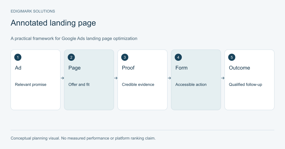
An annotated page diagram should explain the role of each part: orientation, fit, process, proof, action and confirmation. It should not imply that every business needs the same sequence or a fixed number of sections.
For a hypothetical specialist service page, the headline identifies the consultation. The next section explains the problem and intended audience. A process diagram shows what happens. A proof section provides genuine relevant evidence. The form requests details needed for preparation. The confirmation explains the next step.
The diagram is an illustrative wireframe, not a captured client page or a performance result. Its value is showing how information supports the decision. Test the arrangement with your audience rather than copying it as a universal template.
What should be reviewed before the page goes live?
Check the ad promise, page accuracy, form behaviour and receipt of the enquiry. Verify all important links, mobile layouts, error states and measurement. Confirm the team can deliver the promised response and that the advertised offer is available.
Have a subject expert review capabilities and limits. Have the implementation owner verify the public URL. A correct staging preview does not prove the live route works with campaign parameters and external tools.
Record the page version and launch date. This helps later analysis connect a result with the actual change. If the campaign sends several groups to the page, document the affected groups too.
How should the page be maintained after launch?
Review it when the offer, product, price, availability or process changes. Repeat the form test after significant website releases or integration updates. Keep proof current and remove claims that no longer describe the service accurately.
Use campaign and sales feedback to identify new questions. A repeated qualification issue may need clearer page context. A technical question may need a link to documentation. A recurring form error needs a verified repair.
The page is part of a working acquisition journey, not a design asset finished forever. Ask Edigimark to review your paid landing page if the ad attracts relevant attention but the next step remains unclear or difficult.
How can the team keep page changes accountable?
Use a brief change record containing the problem, the proposed explanation, the affected page section and the outcome to review. If the change repairs an obvious failure, state the verification that confirms the repair. If it tests an uncertain choice, state what observation would support or weaken the hypothesis.
Record the traffic segments affected. A page used by several campaign groups may serve different decisions, so an overall conversion rate can conceal a useful improvement for one group and a mismatch for another. Inspect qualified outcomes where the available data permits that distinction.
Keep a copy of the previous page or an approved rollback route before a material revision. This is particularly useful when the change affects forms or external integrations. The aim is operational continuity, not endless experimentation.
Finally, assign the next review to a person. An experiment that stays live without a decision can become an unexamined permanent change. The team should know whether to retain, revise or remove it and what the evidence actually showed.
Frequently asked questions
Should a Google Ads landing page have navigation?
It should provide the routes visitors need without overwhelming the main action. A complex offer may require supporting documentation or company information. Evaluate navigation by the decision it supports rather than following a rule that every paid page must hide the menu.
Is a dedicated landing page always better than a service page?
No. A strong service page can be appropriate when it matches the intent and offer. A dedicated page is useful when a distinct audience or message needs a different explanation. The page’s relevance and usability matter more than its label.
Can reducing form fields increase useful leads?
It can reduce friction, but the effect on quality and routing should be checked. Remove unnecessary requests while keeping information needed for a useful response. Compare valid and qualified outcomes, not only the number of completed forms.
Should every page change be A/B tested?
No. Repair verified failures immediately and use appropriate checks. Controlled experiments are useful for uncertain choices when traffic and implementation support them. Low-volume pages may need user research and careful observation instead of a test that cannot produce meaningful evidence.
What is the most important landing-page metric?
Use the outcome closest to the page’s commercial purpose that can be measured reliably. Suitable enquiries, activated trials or profitable orders can be more useful than button clicks. Keep diagnostic measures to explain the journey and review downstream quality where possible.
Put the ideas to work
Explore our connected growth services →