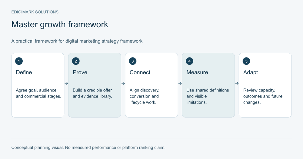
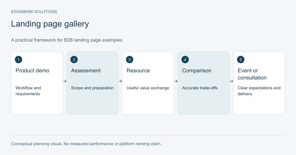
Useful B2B landing page examples show how a page supports a specific buying decision: understanding fit, evaluating requirements, comparing approaches or requesting a relevant conversation. The seven examples below are original illustrative wireframes, not screenshots of client pages and not performance claims. Each explains the structure, the buyer question it answers and what would need to be verified before publication.
Copying a page because it looks polished does not establish that it suits your product. The audience, offer and operational process matter. Use these examples to develop a brief and research questions, then validate the design with people who fit your market.
In this guide
- How should B2B landing page examples be evaluated?
- Example 1: What should a workflow software demo page explain?
- Example 2: How can an integration assessment page clarify scope?
- Example 3: What can a diagnostic resource page do well?
- Example 4: How should a comparison page present a product action?
- Example 5: What does an industry service page need beyond an industry name?
- Example 6: How should a B2B event page prepare the right attendee?
- Example 7: How can a technical consultation page reduce uncertainty?
- What do the demo page examples have in common?
- How should proof placement follow the buyer’s concern?
- How should lead form examples be judged?
- How should a B2B landing page example be selected for adaptation?
- What should a wireframe review ask before design begins?
- How should B2B landing page structure adapt to different buying roles?
- What should be retained when a wireframe becomes a live page?
- Frequently asked questions
How should B2B landing page examples be evaluated?
Ask what the visitor knows when they arrive, what decision the page supports and what happens after the action. Then inspect the information and evidence needed for that decision.
Look beyond visual hierarchy. A page can have an attractive headline, testimonial strip and form while leaving implementation requirements unanswered. Another can be visually simple yet provide exactly the scope and preparation information a buyer needs.
Keep proof honest. These examples deliberately use hypothetical businesses and conceptual structures. They illustrate reasoning without implying that a particular arrangement produced a measured conversion rate.
Conversion rate optimization connects this analysis with research, implementation and meaningful outcomes rather than turning a gallery into a universal template library.
Example 1: What should a workflow software demo page explain?
Imagine a product helping finance teams route purchasing approvals. The page begins with a specific statement of the workflow and the intended team. A short explanation identifies the current problem: requests, approvals and status information are spread across disconnected tools.
The next section shows an accurately labelled workflow diagram or real product view. It explains the supported process, required environment and important limitations. The demo action states what will be covered and which details help the team prepare.
Proof placement follows the decision. Implementation evidence sits near the process; compatibility information sits near requirements. Genuine customer material can be included when it exists, but the wireframe does not invent testimonials to complete the layout.
The form asks for information needed to route and prepare the demonstration. Confirmation explains the next step. Sales receives the stated workflow and offer context.
What this gets right is the link between a product question and a useful conversation. It does not rely on an abstract “Transform finance” headline to communicate fit. The team would still need to verify product accuracy, form usability and whether the page attracts suitable demo requests.
Example 2: How can an integration assessment page clarify scope?
Consider a hypothetical consultancy assessing CRM and marketing data flows. The headline names the assessment. The first explanation describes who it suits and which systems or problems are relevant.
A process section shows preparation, review and next-step discussion. A scope section distinguishes the initial assessment from implementation work. The visitor should not assume that submitting the form begins a full migration or includes services the consultancy has not promised.
The page includes a useful requirements summary: the systems involved, current ownership and the information needed to understand the issue. It can link to relevant service detail without distracting from the assessment’s purpose.
The action reads “Request an integration assessment,” with nearby text explaining what happens next. The receiving team sees the request context rather than a generic lead record.
This structure helps a buyer assess both fit and commitment. CRM integration work benefits from that clarity because data responsibilities and prerequisites matter. Before launch, the team must confirm the scope, preparation requirements and operational capacity to provide the assessment.
Example 3: What can a diagnostic resource page do well?
Imagine a B2B operations guide helping teams identify delays in a process. The page names the resource and shows a readable preview of its contents. It explains the intended reader, the decisions supported and the limits of the guidance.
The description gives a concrete reason to obtain it: a worksheet for mapping responsibilities, a checklist of information gaps and questions for an internal review. It avoids promising that downloading the guide will automatically reduce costs or solve every operational problem.
If registration is used, the form collects proportionate information and explains subsequent communication. The resource is delivered reliably, and the confirmation offers an optional relevant next step rather than disguising a download as a sales request.
The page’s commercial connection remains visible but appropriate. It can explain which service addresses the problem when a team needs help, without interrupting every paragraph with a meeting demand.
What this gets right is the value exchange and readiness match. The team would verify the resource’s usefulness, delivery and audience relevance. Raw download volume would remain separate from qualified sales demand.
Example 4: How should a comparison page present a product action?
Consider a hypothetical platform evaluated against a manual spreadsheet process and a general-purpose task tool. The page identifies the comparison’s scope and explains the situations where each approach can be suitable.
A readable table covers capabilities, implementation responsibilities and limitations using verified information. It does not assign arbitrary scores to declare the product the winner. Where information can change, the page identifies a review owner.
The product section explains its relevant capabilities with evidence. A demonstration action invites the visitor to evaluate their own workflow, while a supporting route provides requirements or documentation.
The comparison should make the buyer more informed even if they choose another approach. That transparency can help the right audience recognise fit and prevents the page from becoming an unsupported attack on alternatives.
What this gets right is decision usefulness. Before launch, product and subject experts need to verify every comparison statement. Later measurement should inspect suitable evaluations and questions, not assume that table views prove a competitive advantage.
Example 5: What does an industry service page need beyond an industry name?
Imagine a service helping manufacturers improve lead handling. The page should explain the actual industry context: long enquiries, different product requirements, distributor relationships or other conditions the provider genuinely understands.
The structure includes a specific problem explanation, service scope, process and relevant evidence. It shows how the work differs from a generic lead-management engagement. If the provider lacks that evidence, the page should not manufacture expertise through terminology alone.
The action asks for the information needed to understand the project. A useful inquiry can include the current process and relevant system context without requiring an excessive questionnaire before the offer is clear.
The page links to supporting capability information where it helps. Marketing automation can support routing and follow-up, but the page should describe the work accurately rather than implying every organisation needs the same setup.
What this gets right is a genuine industry-specific decision. The team would verify its claims and reject a design that merely substitutes a sector name in otherwise identical copy.
Example 6: How should a B2B event page prepare the right attendee?
Consider an online workshop about evaluating a technical implementation. The page leads with the topic, intended audience, timing and format. It explains what attendees can learn and what the session does not cover.
A short agenda names the practical questions. Speaker information should be accurate and relevant. If the session involves a demonstration, say so; if it is a discussion, do not promise a personalised implementation plan for every attendee.
The registration action explains what happens next. Confirmation provides participation information and any preparation. Reminder messages should reflect the event and stop or change appropriately afterward.
The form asks only for details needed for registration and a useful participant experience. The business can offer a later conversation, but should not pretend registration itself was a request for sales contact.
What this gets right is expectation management. The team would verify logistics, delivery and attendee relevance, then examine appropriate follow-on interest rather than treating every registration as a qualified opportunity.
Example 7: How can a technical consultation page reduce uncertainty?
Imagine a specialist consultation about website performance. The page identifies the problem types it can assess and the information needed. It distinguishes an initial discussion from a complete audit or implementation project.
The process explains review, conversation and potential next steps. It does not promise a ranking increase or conversion uplift merely because performance is discussed. Relevant evidence can show the provider’s method without inventing a guaranteed outcome.
The action is specific, such as “Request a performance review.” Supporting text explains the preparation and response process. The form and confirmation remain usable on relevant devices.
The page can connect with web development where implementation may follow, while keeping the current offer’s scope clear. It should not imply that a form submission authorises broad site changes.
What this gets right is the distinction between assessment and execution. Before launch, the provider must confirm the service boundaries and the operational handoff.
What do the demo page examples have in common?
They name a decision, explain fit and provide an action that the business can fulfil. The useful commonality is functional, not a fixed visual layout.
Each needs accurate proof, readable structure and a usable completion route. W3C’s forms tutorial provides practical guidance for labels, instructions and feedback. A polished gallery image does not show whether those interaction requirements are met.
Each also needs a maintained promise. Product changes, service scope and event logistics can make a page inaccurate. Assign ownership instead of assuming the copy remains valid after launch.
How should proof placement follow the buyer’s concern?
Put the relevant evidence near the question it answers. A compatibility statement belongs near requirements; implementation evidence belongs near the process; authentic customer feedback belongs where its context is useful.
Do not place every trust element in one decorative strip and assume it settles the decision. Some buyers need documentation or a specific limitation more than another generic praise quote.
Label illustrations and examples accurately. A conceptual wireframe is useful when its purpose is clear. It becomes misleading if presented as an actual customer page with invented results.
How should lead form examples be judged?
Judge information purpose, usability and the response it enables. A short form can be appropriate for a resource; a tailored review may need more detail. There is no universal correct field count.
Test errors, successful completion and receipt. Preserve the context for the receiving team through suitable CRM integration. A functioning visible form is incomplete if the business cannot locate or handle its request.
Measure valid and qualified outcomes. More submissions can be useful, but only when the page and offer remain appropriate for the audience.
How should a B2B landing page example be selected for adaptation?
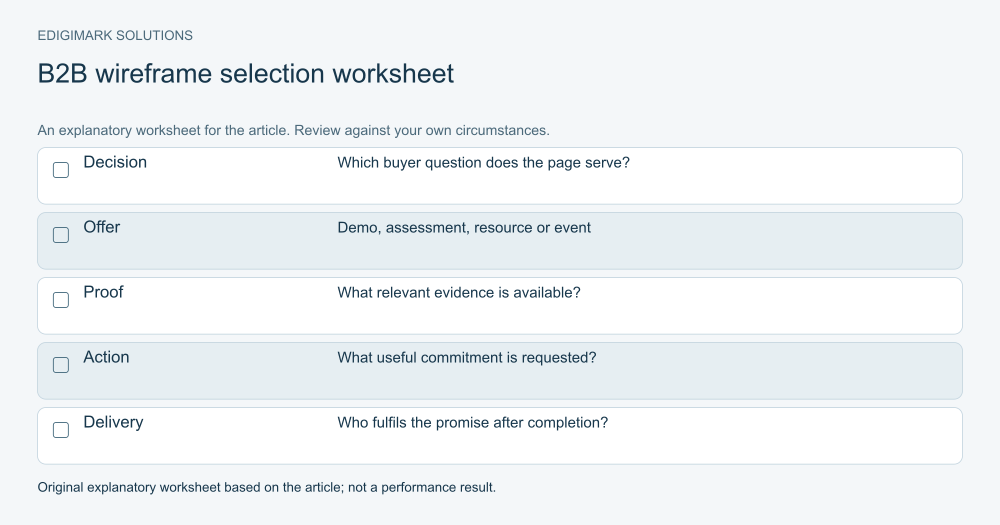
Choose by offer and buying decision rather than visual preference. Write the visitor’s task, information needed, evidence available and promised next step. Use the closest example as a starting structure, then change it to fit the real process.
Validate with relevant users and subject experts. Ask what they understand and what remains uncertain. Verify implementation separately.
Use data analytics to observe meaningful outcomes, with attribution and sample limitations stated. These wireframes do not predict performance. Discuss your B2B page brief with Edigimark if you need to connect the offer, proof and operational response.
What should a wireframe review ask before design begins?
Ask a subject expert to mark every statement that needs evidence or confirmation. Product capabilities, service limits, preparation requirements and commercial promises should not be filled in from imagination merely because the wireframe has space for them.
Ask the operational owner to describe what happens after the action. The form’s fields, confirmation and routing should support that process. If the owner cannot explain the response, the offer is not ready simply because the page structure is complete.
Ask a representative reader to explain the offer and find the information needed to decide. Their task can reveal whether the sequence is sensible or whether a requirement appears too late. This qualitative review helps refine the brief without pretending to measure a conversion uplift.
How should B2B landing page structure adapt to different buying roles?
Keep the offer accurate while emphasising the relevant decision. An operational user may need a workflow example. A technical reviewer may need compatibility and prerequisites. A budget owner may need scope and the implementation responsibilities affecting the investment.
Those needs can coexist on one well-organised page when the content remains readable. Separate pages or resources make sense when the decisions are materially different, not simply because a persona list contains several titles.
Use descriptive headings and contextual routes so readers can find their concern. Avoid assuming that every visitor reads the page in order. A colleague sent directly to a requirements section should still understand the offer’s context.
What should be retained when a wireframe becomes a live page?
Keep the audience question, offer scope, evidence references and intended action with the final version. Record the public destination and the systems receiving the action. This makes later changes easier to evaluate and reduces the risk of removing useful context during a redesign.
Maintain the proof and comparison information. A product change can invalidate a capability statement; a service change can alter preparation or delivery. The live page needs a review owner and triggers tied to those changes.
Finally, preserve the distinction between the conceptual example and real performance. Once your own page is live, report its observed outcomes with appropriate definitions and limitations. The fact that a structure came from a useful wireframe does not establish that it produced a result.
Frequently asked questions
Are these real client landing pages?
No. They are original illustrative wireframes explaining different B2B decisions. They do not represent captured customer pages or measured results. Their value is the reasoning behind structure, proof and actions, which should be validated for your own audience.
Should I copy a competitor’s landing page?
Use public pages to understand market conventions and questions, but do not assume their design works for your offer. You do not know their full results, audience or operating process. Build an accurate page from your own scope and evidence.
Do B2B landing pages need many sections?
They need enough information for the decision. A complex evaluation may require requirements, process and proof; a straightforward event registration may need a simpler structure. Use readable organisation rather than adding sections to match a template.
What is the best proof for a B2B page?
Evidence relevant to the buyer’s risk: accurate product views, implementation information, genuine project examples or transparent scope. Context matters. Do not invent testimonials or treat a result from one project as a guarantee for everyone.
How should a new page be evaluated?
Verify accuracy, usability, delivery and measurement first. Then examine suitable actions and downstream progression, using experiments or careful observation where appropriate. A gallery comparison or attractive design alone does not establish commercial improvement.