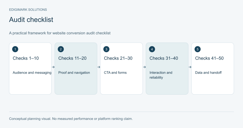
A website conversion audit checklist should establish whether suitable visitors can understand your offer, trust the relevant evidence and complete a meaningful action. The 50 checks below focus on the conversion journey: audience fit, messaging, proof, navigation, forms, mobile usability, performance, measurement and the operational handoff. Record evidence and an owner for each finding rather than turning a checklist total into a promised conversion rate.
This is a conversion-focused audit. It does not replace a full security assessment, technical SEO migration review or marketing-channel audit. Its purpose is to locate barriers between a relevant visit and a useful enquiry, trial, booking or purchase.
In this guide
- How should you use this website conversion audit checklist?
- Audience and offer clarity: checks 1–5
- Messaging and decision context: checks 6–10
- Trust and evidence: checks 11–15
- Navigation and information hierarchy: checks 16–20
- Calls to action: checks 21–25
- Lead form audit: checks 26–30
- Mobile and accessible interaction: checks 31–35
- Performance and technical reliability: checks 36–40
- Measurement and data quality: checks 41–45
- Operational handoff and maintenance: checks 46–50
- Which official guidance supports these conversion checks?
- How should a conversion audit be prioritised?
- What should the website conversion audit report deliver?
- How can a 50-point conversion audit become a usable work plan?
- What should a completed conversion audit retain for future reviews?
- Frequently asked questions
How should you use this website conversion audit checklist?
Choose one important journey and define the intended action. Start with a commercial page or a landing page receiving relevant visitors. Complete the task on mobile and desktop, including any external scheduling or payment step.
For each check, record pass, issue, unknown or not applicable. Add the evidence, affected page, responsible person and verification required. “Unknown” should create an investigation, not be counted automatically as a pass or failure.
Fix verified blockers first. Prioritise uncertain improvements according to evidence, commercial importance and implementation effort. Conversion rate optimization connects this audit with research and an appropriate experiment or repair plan.
Audience and offer clarity: checks 1–5
- Identify the intended visitor. Confirm that the page clearly serves a defined audience and decision. Compare the explanation with the people actually arriving, rather than assuming every visitor fits the business.
- State the offer concretely. Ask an unfamiliar reader to explain what is provided. Replace vague positioning with scope, function or service details that support a real choice.
- Show important fit conditions. Check whether geography, compatibility, business type or preparation requirements are visible where they influence the decision. Hidden limits can create unsuitable enquiries.
- Explain material exclusions. Identify what the offer does not include when the distinction matters. A prospect should not learn an important boundary only after committing or speaking to sales.
- Match the entry promise. Compare the page with the ad, email, link or search context bringing visitors. Verify that the promised subject and action are delivered by the destination.
Messaging and decision context: checks 6–10
- Use a descriptive main heading. The heading should identify the offer or task, not merely an aspirational slogan. Check that it remains understandable when seen without the surrounding design.
- Explain the practical value. Describe the problem addressed and the capability provided. Avoid unsupported claims that imply guaranteed savings, growth or results for every customer.
- Answer the main buyer questions. Review enquiries and research for recurring questions. Confirm that the page answers those necessary for the current decision rather than relying on generic benefits.
- Use language customers recognise. Compare terminology with real conversations. Define technical terms when needed, and avoid internal service labels that make visitors guess whether the offer fits.
- Keep information current. Check scope, availability, commercial terms and product requirements with the responsible expert. An accurate historical statement can become misleading when the offer changes.
Trust and evidence: checks 11–15
- Verify testimonials. Confirm that quotes are genuine, relevant and used appropriately. Remove fabricated, unattributed or misleading statements rather than treating them as harmless design placeholders.
- Contextualise results. For any performance claim, check the starting point, method, period and limitations. One project’s outcome should not appear as a universal guarantee.
- Explain the delivery process. Show the steps and responsibilities a buyer can expect. Process detail can answer implementation concerns more usefully than an unexplained row of logos.
- Represent visuals honestly. Distinguish real product views, conceptual diagrams and hypothetical examples. Do not present an illustration as a captured client result or a customer photograph.
- Make company information findable. Check relevant contact, business and support information. A visitor evaluating a commitment should have an appropriate route to understand who provides the offer.
Navigation and information hierarchy: checks 16–20
- Make important content scannable. Use descriptive headings and readable sections. Ask a visitor to locate requirements, process and next steps without reading every sentence from the top.
- Link useful supporting detail. Provide relevant documentation or explanations when they help the decision. Removing every link can make a complex offer harder to evaluate.
- Remove unrelated distractions. Inspect competing promotions and interface elements. Keep those serving a real user task, while reconsidering elements that interrupt the main decision without clear value.
- Check contextual commercial links. Supporting articles should provide a useful route to relevant services or products. Confirm that the destination matches the context and the link text explains it.
- Inspect menu terminology. Ask someone unfamiliar with the site to find the appropriate offer. Their route can reveal assumptions hidden by the team’s familiarity with internal naming.
Calls to action: checks 21–25
- Name the action accurately. The CTA should describe what happens, such as requesting a quote or obtaining a resource. Avoid a generic label that hides the commitment.
- Match commitment to readiness. Check whether the action suits the page’s purpose. An introductory guide and a provider evaluation page may require different next steps.
- Explain the next step. State what the person receives or what happens after acting. Avoid response promises or tailored outputs the team cannot consistently provide.
- Place actions in context. Check visibility after relevant information, particularly on long pages. Repetition should help ready visitors act rather than interrupt every paragraph with the same demand.
- Keep supporting actions distinct. If documentation or a lower-commitment option is needed, explain its role. Several identical-looking buttons with different consequences can make the decision confusing.
Lead form audit: checks 26–30
- Give each field a purpose. Identify how the information supports delivery, routing or qualification. Reconsider fields that are never used, while preserving details needed for a useful response.
- Provide persistent labels. Check that each control is identified and understandable. A placeholder that disappears while typing should not carry all the information required to complete the field.
- Explain required formats. Give instructions where a specific format or document is needed. Do not wait until submission to reveal a requirement the visitor could not reasonably infer.
- Test errors and recovery. Submit invalid and incomplete data. Check that feedback identifies the issue, explains correction and preserves appropriate input so the person can recover.
- Verify successful receipt. Complete a valid submission and confirm it reaches the intended system and owner. A success animation does not prove the business received the enquiry.
Mobile and accessible interaction: checks 31–35
- Complete the task on a phone. Check fields, keyboard behaviour, uploads and scheduling. A responsive screenshot is insufficient when the interactive path fails on a smaller device.
- Inspect overlays and banners. Confirm they do not cover essential content or actions. Test dismissal and revisit behaviour, including any consent interface affecting the task.
- Check keyboard navigation. Important controls should be reachable and usable in a sensible order. Verify visible focus and avoid trapping the visitor in an unintended interface region.
- Make feedback understandable. Confirm success and error states communicate more than colour alone. Relevant users should be able to understand whether the action succeeded and what to do next.
- Review readability and control use. Inspect text size, contrast and interaction targets under realistic conditions. The goal is task completion for different users, not only a polished desktop view.
Performance and technical reliability: checks 36–40
- Inspect the actual destination. Open the public URL with its normal campaign or link parameters. Check redirects and external steps rather than assuming a staging preview matches the live journey.
- Locate delayed essential content. Identify whether the offer, form or product information loads late. Prioritise the assets or scripts obstructing the task instead of optimising decorative elements first.
- Check layout stability. Observe whether content or controls move unexpectedly while loading. A button shifting under a finger can create errors even when the page eventually looks correct.
- Test interactive responsiveness. Check whether form and navigation controls respond promptly in realistic conditions. Investigate slow scripts or dependencies affecting the action rather than relying solely on a lab score.
- Repeat checks after releases. Identify the website and integration changes that require task testing. A journey that worked last month can fail after a form, checkout or booking update.
Measurement and data quality: checks 41–45
- Define the conversion event. Confirm that the event represents the intended completed action. A button click or form start should not silently substitute for successful receipt or purchase.
- Check counting and duplicates. Review repeat submissions, revisited confirmation pages and multiple recording paths. Inflated or missing actions can make the reported rate misleading.
- Specify the denominator. State whether the rate uses users, sessions or eligible exposure. Keep the definition consistent when comparing pages, periods or experiments.
- Separate quality stages. Distinguish raw, valid and qualified leads or appropriate purchase outcomes. A larger initial count should not hide poorer fit, cancellations or returns.
- Document reporting limits. Record consent-related gaps, attribution assumptions and conversion lag. The report should describe observed evidence without claiming a complete history of every influence.
Operational handoff and maintenance: checks 46–50
- Assign an enquiry owner. Verify routing, notifications and responsibility for the next action. A shared inbox with no review process is not a dependable handoff.
- Preserve request context. Give the receiving team the offer, stated need and useful details already supplied. The person should not have to repeat the entire request unnecessarily.
- Handle existing contacts deliberately. Define duplicates, current customers and unsupported requests. Avoid placing everyone into one generic prospect sequence regardless of their relationship with the business.
- Suppress inappropriate follow-up. Change or stop automated messages when a person replies, books or enters an active conversation. Repeated acquisition prompts can conflict with a useful human response.
- Maintain an owned action log. Record findings, priorities, repairs, verification and review dates. Completed implementation and observed commercial effect should remain distinguishable in the report.
Which official guidance supports these conversion checks?
W3C’s forms tutorial provides practical guidance for accessible controls, instructions and feedback. Google’s Web Vitals documentation describes field measures for loading, responsiveness and visual stability. Google Analytics funnel documentation explains how defined sequences can be inspected, with reporting choices affecting interpretation.
These sources support particular technical concepts. The full checklist is an editorial framework for connecting those concepts with an offer and business process, not an official platform scoring system.
How should a conversion audit be prioritised?
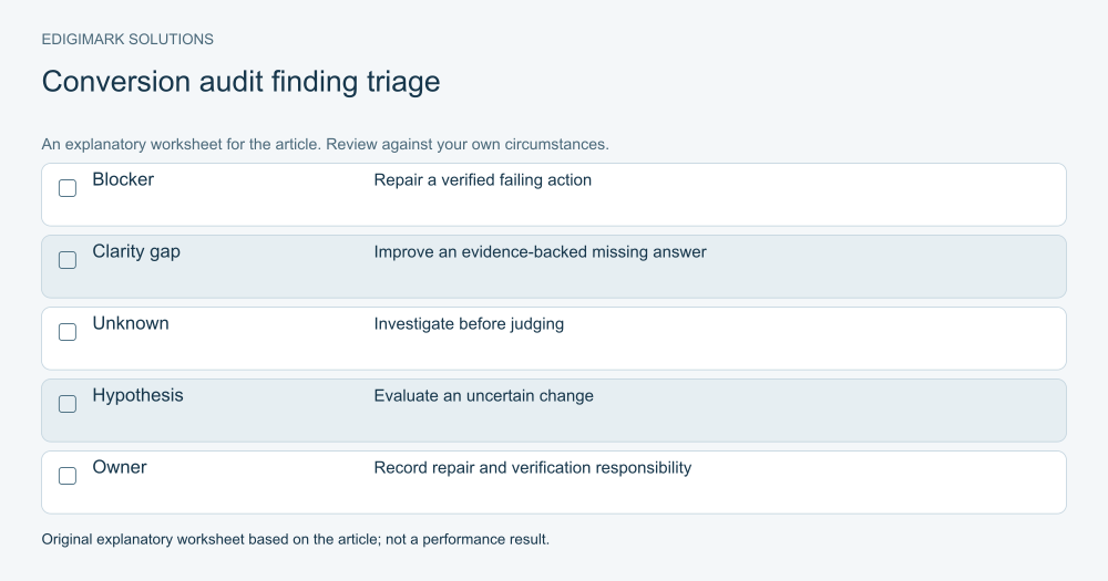
Use severity and evidence. A failed enquiry route is a verified blocker. Missing scope information may be a supported clarity problem. A proposed visual rearrangement may remain an uncertain hypothesis.
Prioritise the affected journey’s commercial importance, audience relevance and repair effort. Avoid assigning every finding equal weight or making a total score imply an expected revenue improvement.
Use web development for implementation problems, data analytics for measurement issues and CRM integration for records and routing. Marketing automation can address contextual delivery and suppression after the process is defined.
What should the website conversion audit report deliver?
Deliver an evidence-based action list: page or task, finding, severity, owner, proposed repair and verification. Include unknowns requiring further research. Keep screenshots or test records where they clarify the issue without exposing personal information.
For uncertain choices, record a hypothesis and an appropriate evaluation method. For verified failures, repair and repeat the failing task. Do not require an experiment to decide whether a form should work.
The audit is useful when it changes the journey in a reviewable way. Ask Edigimark to review your conversion path if you need help turning findings into owned, verified improvements.
How can a 50-point conversion audit become a usable work plan?
Group related findings into one repair where appropriate. If several checks reveal the same mobile form problem, do not create five separate tasks merely because the checklist has five relevant rows. Keep the evidence linked to a single owned change and verify every affected state afterward.
Separate content review from technical implementation. A page may need confirmed service requirements before a writer can improve the explanation. A developer may need approved validation behaviour before changing a form. Record those dependencies so the task list does not imply that every issue is immediately ready to fix.
Identify the commercial journey affected. A minor issue on a rarely used page can be less urgent than the same issue on a key enquiry route. Use that context alongside severity and evidence rather than prioritising only by the number of failed checks.
What should a completed conversion audit retain for future reviews?
Keep the date, public page, device context and task tested. A later reviewer should be able to understand what the finding described and repeat the relevant check. Store evidence in a way that avoids exposing real prospect data unnecessarily.
Record the approved repair and its verification separately from the outcome review. The first confirms that the implementation addressed the issue; the second examines what happened with suitable visitors afterward. A change can be correctly implemented while its commercial effect remains uncertain.
Include unresolved questions. An audit may suggest that visitors need pricing context, but customer research may still be necessary to determine what information is useful and appropriate. That question belongs in the plan rather than being disguised as a definite design requirement.
This record makes the checklist repeatable. It helps the team detect a returning failure after a release and preserves the reasoning behind content or interaction changes when people or suppliers change.
Frequently asked questions
Should every website pass all 50 checks?
Some checks will be irrelevant to a particular offer or journey. Mark those as not applicable and explain why. The purpose is a useful review, not a universal badge. Unknowns should trigger investigation rather than be treated as automatic passes.
Can the checklist predict a conversion uplift?
No. It identifies issues and hypotheses. The commercial effect depends on audience, offer and implementation, and should be measured appropriately. A repaired blocker confirms technical improvement without guaranteeing a particular lead or revenue increase.
How often should a conversion audit run?
Review important journeys periodically and after material offer, website or integration changes. Significant campaign expansion can also justify a focused review. Match the cadence to the site’s change rate and business importance rather than a universal schedule.
Is a conversion audit the same as a full website audit?
No. This checklist focuses on the route to meaningful actions and the handoff. A broader audit can include more extensive SEO, security, infrastructure and governance work. The scopes can connect, but their findings should remain clear.
What should be fixed first?
Fix verified failures preventing suitable people from completing or receiving the intended action. Then address well-supported relevance and clarity gaps. Use research and experiments for uncertain design choices rather than prioritising them above a broken journey.