Landing page best practices start with a clear audience, a useful offer and an action that fits the visitor’s decision. Explain what is offered, who it suits, what evidence supports it and what happens next. Make the page and form usable, then judge the result through suitable enquiries or other meaningful outcomes rather than a design convention or raw click count.
A landing page can receive visitors from search, email, social campaigns, events or direct links. Those routes create different expectations. The page needs to fulfil the specific promise that brought the person there, while giving them enough information to decide whether to continue.

In this guide
- What should landing page best practices help you decide?
- How should landing page messaging describe the offer?
- What should the landing page first screen contain?
- How should the page explain who the offer is for?
- What belongs in a landing page process section?
- How should landing page proof be selected?
- What makes a landing page CTA useful?
- How should lead form design balance friction and qualification?
- What should landing page confirmation and delivery provide?
- How should landing page usability be verified?
- How should landing-page results be measured?
- Which landing page changes should be tested?
- What does a useful landing page anatomy look like?
- How should a landing page stay accurate after launch?
- How do landing-page principles change across common offers?
- What should a landing page brief give the writer and designer?
- Frequently asked questions
What should landing page best practices help you decide?
They should help you design a useful experience, not prescribe a universal layout. A consultation request, event registration, product trial and resource download involve different risks, information needs and commitments.
Write a brief describing the audience, entry context, offer, evidence and action. Include the conditions that make the offer unsuitable. A clear brief prevents the page from becoming a collection of fashionable components without a coherent task.
Choose the main commercial measure. A resource delivery, a valid enquiry and a qualified meeting are different outcomes. Keep intermediate interactions visible for diagnosis, but do not treat every button click as proof of lead generation.
Use conversion rate optimization to connect the page brief with research, implementation and meaningful measurement.
How should landing page messaging describe the offer?
Use a concrete headline that tells the visitor what they can evaluate or request. “Request a review of your CRM data flow” is more useful than “Discover limitless growth” when that is the service provided.
Follow with an explanation of the problem, intended audience and scope. The visitor should understand the offer without knowing your internal terminology. Avoid unsupported superlatives and implied results the business cannot substantiate.
Match the entry promise. An email about a workshop should lead to the workshop’s topic, date and participation information. A campaign about an implementation review should lead to the review’s purpose and requirements.
If the offer has material limits, make them visible. Geography, compatibility, preparation or eligibility can influence the decision. Hiding them may increase unsuitable actions while making the experience less honest.
What should the landing page first screen contain?
Give the visitor orientation: the subject, the intended value and a clear route to the action. It can also include a short proof element or relevant visual when those help understanding.
Avoid filling the space with large decorative elements before the offer becomes clear. On a phone, check how much room navigation, banners and overlays consume. A useful headline should not sit beneath several screens of unrelated interface.
The first screen is not required to contain every detail. It should make the page understandable and worth exploring. Buyers with complex concerns may need deeper sections before they are ready to act.
Inspect the actual page on relevant devices. A desktop mockup cannot reveal every issue with text wrapping, controls, image crops or mobile keyboards.
How should the page explain who the offer is for?
Describe fit using conditions tied to the service or product. A business software offer may require a particular workflow or environment. A consultation may suit companies preparing for a defined project. An event may serve a specific level of experience.
Avoid empty audience claims such as “For every ambitious business.” They provide little help in deciding whether the offer addresses the visitor’s situation.
Use an explicitly labelled illustrative example when it clarifies fit. For a hypothetical integration assessment, explain that a team with several disconnected customer-data systems may need a different review from a team using one standard platform.
Describe unsuitable cases where the distinction matters. This can reduce wasted requests and prepare a better conversation with appropriate prospects. The aim is useful qualification, not creating exclusivity for its own sake.
What belongs in a landing page process section?
Explain what happens before, during and after the action. For a review session, say what information is requested, what the discussion covers and what the person receives afterward. For a trial, explain setup and evaluation requirements. For a resource, describe delivery.
Keep the process accurate and manageable. Do not promise a response time or tailored output the team cannot consistently provide. If the process depends on the request, explain that condition.
A simple diagram can help when the sequence is important. Label it as a conceptual process rather than a captured result. Use readable text and ensure the same essential information is available in the page copy.
Process clarity reduces uncertainty. It also gives the operations team a concrete promise to fulfil rather than leaving each enquiry to be handled differently.
How should landing page proof be selected?
Choose evidence answering the relevant risk. A genuine project example may show experience with a workflow. An accurate product view may show capability. Transparent service scope may reduce uncertainty about what is included.
Present any outcome with context and limitations. State what was changed, how the result was measured and which conditions matter. Do not imply that one project’s result is a guarantee for every buyer.
Testimonials and logos need to be authentic and used appropriately. A hypothetical example should be clearly labelled. A decorative image should not imply a real customer relationship that does not exist.
Place evidence near the question it answers. A quote about implementation belongs near the implementation explanation. A product specification belongs near the compatibility decision. Proof is more useful when its relevance is clear.
What makes a landing page CTA useful?
The CTA should name a sensible next action and reflect what the business will deliver. “Get the checklist,” “Request a quote” and “Book an implementation discussion” create different expectations.
Use nearby text to explain the commitment where necessary. A person may want to know whether the action opens a form, books a meeting or begins a paid process. Do not create a surprising commitment after the click.
Place the action where visitors have enough context to consider it. On a longer page, a repeated action can be appropriate after important information, but constant repetition can interrupt reading.
Supporting actions should have a clear role. A technical buyer may need documentation before requesting a meeting. Keep that route available without making the page’s main purpose ambiguous.
How should lead form design balance friction and qualification?
Ask for information needed to deliver the offer or prepare a useful response. A field should have a specific purpose. If the team never uses the information, reconsider collecting it.
Use persistent labels, clear instructions and helpful validation. W3C’s forms tutorial explains practical accessibility considerations such as identifying controls, giving instructions and providing feedback. These also help visitors recover from mistakes.
Test the form with representative tasks and devices. Check the successful submission, required-field errors, invalid input and any file or scheduling step. Confirm receipt by the intended system and owner.
There is no universal correct field count. A tailored service request may need more context than a resource download. Measure suitable outcomes and operational usefulness rather than removing every field simply to maximise submissions.
What should landing page confirmation and delivery provide?
Tell the visitor the action succeeded and explain the next step. Provide the promised resource, booking route or review information. A vague thank-you message can leave people unsure whether they need to do anything else.
Make delivery reliable. Test links and email receipt where those are part of the offer. If the resource changes, update the confirmation and automated messages together.
Preserve context for the receiving team. CRM integration can connect the page and form record with appropriate fields and ownership. Marketing automation can support delivery and acknowledgement.
Handle existing contacts and duplicate requests deliberately. A current customer should not accidentally enter an unrelated prospect process because they completed a new form.
How should landing page usability be verified?
Walk through the task on mobile and desktop. Check text readability, controls, focus behaviour, overlays and external steps. Test with a keyboard where relevant and inspect the feedback provided after errors.
Check performance problems that obstruct the task, such as oversized assets or delayed form scripts. A lab score can guide diagnosis, but the actual journey needs verification under realistic conditions.
Review navigation by purpose. A focused page should avoid unrelated distractions, but a complex offer may need routes to documentation or company information. Removing every link is not a universal best practice.
Web development should verify implementation, while the page owner confirms that the content remains accurate. Both are necessary: a technically smooth page can still describe the wrong offer.
How should landing-page results be measured?
Define the action and denominator before reporting a rate. Distinguish users, sessions and page exposure where the reporting setup uses them. Keep counting methods consistent across comparisons.
Review quality after the action. A consultation page should examine suitable requests and progression. A resource page should examine successful delivery and appropriate engagement with the next step. A product page should examine useful trial or purchase outcomes.
Google Analytics funnel documentation illustrates how a defined sequence can help inspect steps, while open and closed funnel choices affect interpretation. Make sure the report matches the journey you are investigating.
Data analytics can help connect evidence, but it cannot infer every reason a person acted or left. Combine metrics with customer feedback and task research.
Which landing page changes should be tested?
Test uncertain choices supported by a clear problem hypothesis. For example, if prospects repeatedly misunderstand what a session includes, compare a more concrete process explanation where the traffic and implementation support a meaningful experiment.
Repair verified failures directly. A broken link or inaccessible control needs QA, not a prolonged test comparing a failing version with a functioning one.
Set the experiment’s outcome and guardrails before launch. A higher form rate can be unhelpful if the change removes necessary qualification or worsens another important action. When traffic is limited, use research and cautious observation with the limits stated.
Keep a record of the page version and material changes. It helps the team interpret results without inventing a causal story from a coincidental movement.
What does a useful landing page anatomy look like?
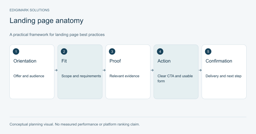
For an illustrative B2B assessment page, the anatomy might be: a specific offer headline, an explanation of fit, a practical process, relevant evidence, a clear action and a confirmation describing the next step.
The sections should support questions rather than exist because a template includes them. If implementation requirements are important, give them space. If the action is a simple resource download, avoid adding irrelevant sales complexity.
The accompanying anatomy diagram is conceptual, not a screenshot of a client page or a claim of performance. Its purpose is to show how each part helps the visitor decide.
Use the structure as a starting brief, then validate it with your audience. A useful page may be shorter, longer or arranged differently depending on the offer and entry context.
How should a landing page stay accurate after launch?
Assign an owner and review triggers. Changes in offer scope, eligibility, product capability, availability or delivery process should prompt a page review. Significant website or integration releases should prompt task testing.
Keep the entry messages aligned. An updated page with an old email or ad promise still creates a mismatch. Review the assets linked to the page together.
Use recurring prospect questions to improve the explanation. Some may belong on the page; others may deserve a supporting resource. Keep the main action focused while making relevant detail available.
Discuss your landing page with Edigimark if you need to connect messaging, proof, forms and follow-up around a clearer customer decision.
How do landing-page principles change across common offers?
For an event registration, visitors need the topic, timing, intended audience, format and participation details. The form should support registration, and the confirmation should explain attendance. A page that hides basic logistics while asking for extensive commercial information creates an avoidable mismatch.
For a resource download, visitors need a credible description of the content and a reliable delivery route. The resource should fulfil the promise rather than reveal itself as a generic brochure. Subsequent communication should reflect the request and applicable permissions.
For a product trial, visitors need to know what they can evaluate, which requirements apply and what happens when the trial ends. Setup work and compatibility matter. A large signup count is less useful when most people cannot activate the product.
For a tailored consultation, visitors need scope, preparation and the expected discussion. A few qualification fields may make the response more useful, but the page should explain the value before requesting that information.
These differences show why a universal page template is insufficient. The shared anatomy should be adapted to the actual exchange and decision.
What should a landing page brief give the writer and designer?
Provide the entry promise, reader’s task, offer limits, approved evidence and primary action. Identify the questions the page must answer and the information required after submission. Include the sources or subject experts needed to verify claims.
State the technical dependencies too: CRM fields, booking tools, resource delivery and measurement. A strong draft can still fail at launch if those systems are assumed rather than tested.
The brief should make the customer decision and operational promise explicit. That gives the writer, designer and developer one shared purpose instead of three separate interpretations of what “high converting” is supposed to mean.
Frequently asked questions
Is there one ideal landing-page layout?
No. The audience, offer, entry context and commitment determine the useful structure. Shared principles such as clarity and usable actions remain important, but a workshop registration and a complex product evaluation need different explanations.
Should a landing page be short?
It should contain enough information for the decision without unnecessary repetition. A simple resource offer can be concise; a high-commitment service may need scope, process and proof. Use clear structure so visitors can find the information they need.
Should all links except the CTA be removed?
No. Remove irrelevant distractions, but preserve routes that help evaluation or establish necessary context. Technical documentation or company information can be useful for a complex offer. Judge each link by its purpose rather than a universal rule.
What is the best CTA text?
Use accurate language naming the action and value the visitor will receive. A context-specific request is usually clearer than a generic “Submit.” Test uncertain wording where useful, but do not make promises the process cannot fulfil.
How should success be judged?
Use meaningful, suitable actions and the relevant downstream outcomes. Keep raw form or click counts for diagnosis, but examine delivery, quality and commercial progression. A visually polished page is only one part of a successful journey.