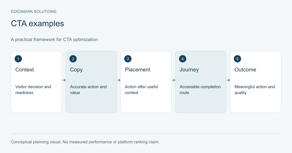
CTA optimization helps visitors understand and complete an appropriate next action. Match the call to action with the page’s purpose, name the action accurately, explain the commitment and remove avoidable interaction barriers. Evaluate meaningful outcomes and lead quality rather than assuming that more button clicks or a fashionable colour proves a better customer journey.
A CTA can be a button, a text link, a form action or another control. Its job is to connect information with a decision. Good copy cannot rescue an unsuitable offer, and a visible button cannot compensate for a destination that fails to deliver the promise.
In this guide
- What should CTA optimization improve?
- How should CTA copy name the action?
- How does call to action placement depend on readiness?
- What should the text near a CTA explain?
- Example 1: How can a resource CTA be clearer?
- Example 2: How should a consultation CTA set expectations?
- Example 3: How should a trial CTA explain activation?
- Example 4: What should a quote CTA communicate?
- Example 5: How can a contextual link support a smaller decision?
- How should CTA friction be investigated?
- Should a page have one CTA or several?
- How should CTA experiments be measured?
- Why are button-colour rules unreliable?
- How can CTA changes remain accurate after launch?
- What should a CTA inventory record?
- How should CTA copy review avoid wording that obscures the task?
- Frequently asked questions
What should CTA optimization improve?
Begin with the task. What does the visitor need to do, and what will the business provide? A resource download, consultation request, account signup and purchase involve different commitments.
Define the completed outcome and any quality measure. A click opens the route; it does not necessarily complete the action. A form can fail, a booking can remain unfinished or a lead can be unsuitable.
Inspect the page context before changing the control. Visitors may need scope, proof or requirements before they can decide. A button that seems ineffective may sit on a page that never explains the offer.
Conversion rate optimization connects CTA work with the wider decision and measurement process rather than treating microcopy as a separate growth trick.
How should CTA copy name the action?
Use language that describes what happens and, where helpful, what the visitor receives. “Get the implementation checklist” is clearer than “Submit” for a resource form. “Request a project assessment” is clearer than “Learn more” when the action begins a tailored review process.
Do not overstate the value or hide a commitment. A button saying “See pricing” should lead to pricing information or clearly explain any necessary step. It should not unexpectedly require a sales meeting before revealing anything useful.
Keep the wording concise enough to scan, but do not sacrifice meaning to meet an arbitrary word count. The control can be supported by nearby text explaining preparation, timing or the nature of the response.
Use consistent terminology across the page, form and confirmation. If the page calls the offer a review, the next screen should not introduce an unexplained “discovery sprint.”
How does call to action placement depend on readiness?
Place the action where visitors can reasonably evaluate it. A simple, familiar offer may support an action near the beginning. A complex service may need scope and process information before many visitors feel ready.
Long pages can provide the same action after relevant sections. The repetition should help people act when they have enough context, not interrupt every paragraph. Keep the repeated promise consistent.
Review mobile layouts separately. A fixed action can be useful, but it should not cover essential content, validation messages or other controls. Test the actual task rather than deciding from a screenshot.
Do not infer readiness from scroll depth alone. A visitor can scroll quickly without understanding the offer or stop early because they already have the needed information. Use task observations and meaningful outcomes alongside interaction data.
What should the text near a CTA explain?
Explain the important consequence or requirement. For a consultation, visitors may need to know what it covers and whether preparation is required. For a trial, they may need to know the setup conditions. For a resource, they may need to know how it will be delivered.
Avoid irrelevant reassurance added only because a template includes it. “No commitment” should be accurate and useful in the actual process. “Instant access” should be used only when access is actually immediate.
Address the question that prevents action. If prospects are unsure who should attend a technical review, a brief sentence can help more than another generic benefit claim.
Keep the explanation visible and readable. Important commercial terms or requirements should not be hidden in tiny text while the button makes a broader promise.
Example 1: How can a resource CTA be clearer?
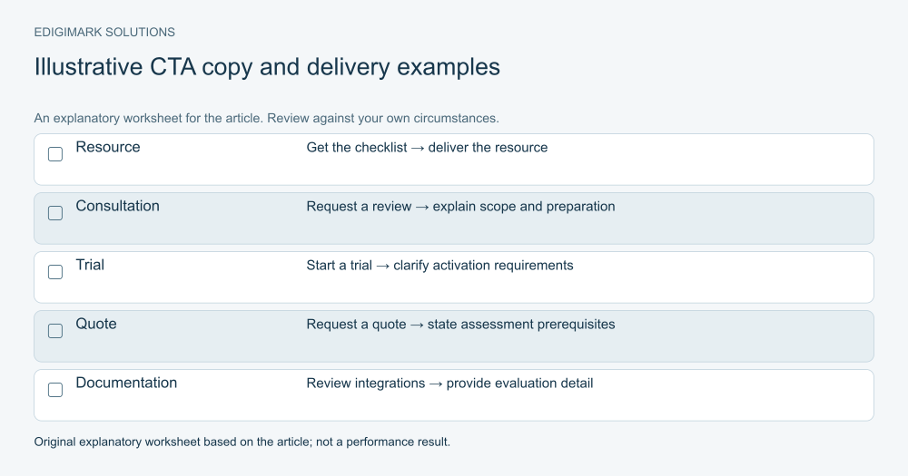
For an illustrative implementation guide, a vague button might say “Unlock success.” A clearer option is “Get the implementation checklist,” supported by a short description of the checklist’s contents and delivery.
The improvement is the meaning, not a guaranteed uplift. A visitor can judge whether the resource helps their task and what the action provides. The form should then deliver that resource reliably.
If registration is used, ask for information needed for the exchange and explain subsequent communication. Do not disguise a sales request as an immediate download. The confirmation should provide the promised route and state any next step.
Measure delivery and appropriate follow-on activity as well as clicks. A resource CTA can attract attention without serving the intended audience, so relevance remains part of the review.
Example 2: How should a consultation CTA set expectations?
For a hypothetical CRM assessment page, “Request a CRM integration review” is more specific than “Contact us.” Nearby text can explain the systems the team needs to know about and what the initial review covers.
The form should support preparation and routing. A few relevant details can help the response; an extensive questionnaire may be inappropriate before the visitor understands the offer.
Keep the process consistent. The receiving person should see the stated need, and the acknowledgement should refer to the review rather than a generic sales sequence.
CRM integration and marketing automation can support that operational connection. CTA optimization remains incomplete if the visible request is clear but the business loses its context after submission.
Example 3: How should a trial CTA explain activation?
For a software offer, “Start your trial” should be supported by accurate information about what can be evaluated and any required setup. A trial needing imported data or a team configuration is different from one that works immediately.
If a product tour is available as a lower-commitment option, explain how it differs. Do not make two buttons look equivalent when one begins account creation and the other opens a demonstration.
Measure activation and suitable usage where the business can record them reliably. A signup click or account creation alone may not indicate a meaningful evaluation.
These examples are illustrative, not captured client pages or claims of performance. Their purpose is to show how accurate action language supports a better-informed decision.
Example 4: What should a quote CTA communicate?
“Request a quote” should lead to a process that can actually produce a quote or explain the assessment needed first. If the business must inspect a project before pricing it, the page should make that condition clear.
Tell visitors what information helps the response. For a service, this might be the location, requirement and relevant project details. Avoid requesting unrelated information that nobody uses.
The confirmation should describe the next step without making an unsupported timing promise. The receiving owner should understand that the person asked for commercial information, not merely a newsletter.
Judge the CTA by suitable requests and useful progress. A higher raw count created by hiding eligibility can make the process less efficient.
Example 5: How can a contextual link support a smaller decision?
A text link can help a visitor obtain information before a major action. “Review the supported integrations” or “See the preparation requirements” can be more useful than another immediate demo prompt.
Use descriptive wording that makes the destination understandable. Keep the link connected to the question being discussed rather than adding it wherever a keyword appears.
Contextual website actions should support the journey without pretending every click is a lead. A documentation visit can be a useful evaluation step even when it does not produce an immediate enquiry.
Coordinate those routes with digital marketing strategy so the page’s primary and supporting actions serve the intended audience rather than competing for attention arbitrarily.
How should CTA friction be investigated?
Test the action on relevant devices and interaction methods. Check whether the control can be reached, whether its label is clear, whether the destination works and whether errors can be corrected.
W3C’s forms tutorial provides practical guidance for labelled controls, instructions and feedback. A clear button is only part of a usable form.
Inspect overlays, disabled states and unexpected redirects. A click can appear in analytics even when the visitor cannot finish the next step. Confirm the actual completed task and receipt by the business.
Web development should verify the public route after a repair. CTA friction is not always a copy problem; the interaction or integration can be the barrier.
Should a page have one CTA or several?
Keep a clear primary action aligned with the page’s purpose. Add supporting actions when they help a meaningful decision, such as viewing documentation or understanding requirements.
Avoid several competing commercial promises with no hierarchy. A visitor should not have to guess whether the business wants a quote request, event registration or product trial on a page that supposedly serves one offer.
Different pages can have different actions. A broad educational guide may appropriately lead to a deeper explanation, while a commercial evaluation page may invite a consultation. One universal CTA across the entire site can ignore those differences.
Review the choice through task research. Ask what a visitor expects each action to do and which route they would use. Their interpretation is more useful than assuming the visual hierarchy communicates perfectly.
How should CTA experiments be measured?
Start with a hypothesis about a documented barrier. A label change might help clarify the offer, while placement might make a ready action easier to find. Define the completed outcome and important guardrails.
Do not stop at button clicks. Track task completion, suitability and downstream value where reliable. A wording change can attract more clicks while increasing disappointment if the destination does not match expectations.
Use a controlled experiment when traffic and implementation support it. Otherwise, use task research and careful observation with limitations stated. There is no universal test duration or magic number of clicks that settles every CTA choice.
Microsoft’s experimentation guidance supports attention to data quality and guardrails alongside the primary outcome. Data analytics helps connect those measures with the business decision.
Why are button-colour rules unreliable?
Colour can influence visibility and contrast in a specific layout, but a universal claim that one colour converts best ignores the page, audience and accessibility requirements.
First ensure the action is visually identifiable and usable. Check contrast, focus and states. Then investigate whether visitors understand the action and can complete it. A bright button with misleading copy remains a poor experience.
If a visual choice is uncertain, evaluate it with an appropriate method and meaningful outcome. Do not present a result from another website as a guaranteed rule for your own.
The practical priority is the connection between offer, context, control and destination. Cosmetic changes deserve attention when evidence shows they affect that connection.
How can CTA changes remain accurate after launch?
Assign an owner to the action and the promise behind it. If the offer or process changes, update the page, form, confirmation and automated messages together.
Repeat the task after significant releases or integration updates. A label can remain correct while the booking route or resource link becomes unavailable. Keep a record of the public destinations and the actions they support.
Use sales and customer feedback to identify misleading expectations. If people repeatedly ask what happens next, nearby explanation may need improvement. If they expect something the process does not provide, revise the promise.
Discuss your website actions with Edigimark if visitors can read the offer but remain uncertain about the next useful step.
What should a CTA inventory record?
List each important action with its page, visible wording, destination and promised outcome. Include any supporting text that changes the commitment. A button called “Book a review” may have a different meaning when nearby copy says the request must first be assessed.
Identify repeated actions that use different names for the same offer, and identical names that lead to different processes. Those inconsistencies can make navigation confusing, particularly when visitors move between a guide, service page and form.
Record the completion event and receiving owner. A CTA inventory should connect the visible promise with the operational task rather than end at a URL. It gives writers and developers a shared reference when labels or integrations change.
How should CTA copy review avoid wording that obscures the task?
Read the proposed label without the visual design and ask what it will do. If the answer depends on a metaphor or insider phrase, clearer language may serve the visitor better. Brand tone can remain warm without hiding whether the action downloads, requests, books or purchases.
Check verbs against the actual process. “Book” implies scheduling; “request” can imply review; “view” implies information; “buy” implies a transaction. The distinction matters when an action creates a commitment or requires a human response.
Ask a few representative people what they expect after clicking. Their answers can reveal a mismatch before launch. This is a usability check, not proof of a conversion uplift, but it provides specific evidence for choosing wording. Follow it with verification that the destination and confirmation fulfil the expectation the label creates.
After copy approval, check the deployed control again. Text can be truncated on a narrow screen, a translated label can change meaning, or a reused component can lead to an old destination. The approved sentence and the live task need to match.
Frequently asked questions
What is the best CTA wording?
Accurate wording that names the action and fits the visitor’s decision. “Get the checklist” and “Request a consultation” serve different offers. Use nearby explanation for important commitments. Do not assume a generic power phrase will outperform clear task language.
Should every CTA be a button?
No. A descriptive text link can support an information step, while a button can signal a form or primary action. Choose an appropriate control and make its behaviour understandable. The task and accessibility matter more than a universal visual rule.
Does placing the CTA above the fold guarantee more leads?
No. Visibility can help, but the visitor may need more context before acting. A complex offer may require scope, proof and requirements. Use placement to support readiness, and measure completed suitable actions rather than only early clicks.
Should the same CTA appear on every page?
Only where the same action fits the page’s purpose. Educational, evaluation and commercial pages can support different next steps. Keep the offer language consistent while allowing the action to reflect the decision being made.
What should happen after the CTA click?
The destination should fulfil the promise and provide a usable completion route. Confirmation should explain success and the next step. Preserve the request context for the receiving team, and judge the full journey rather than the click alone.